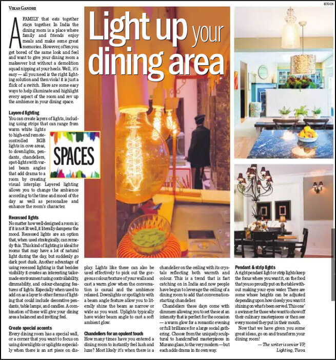
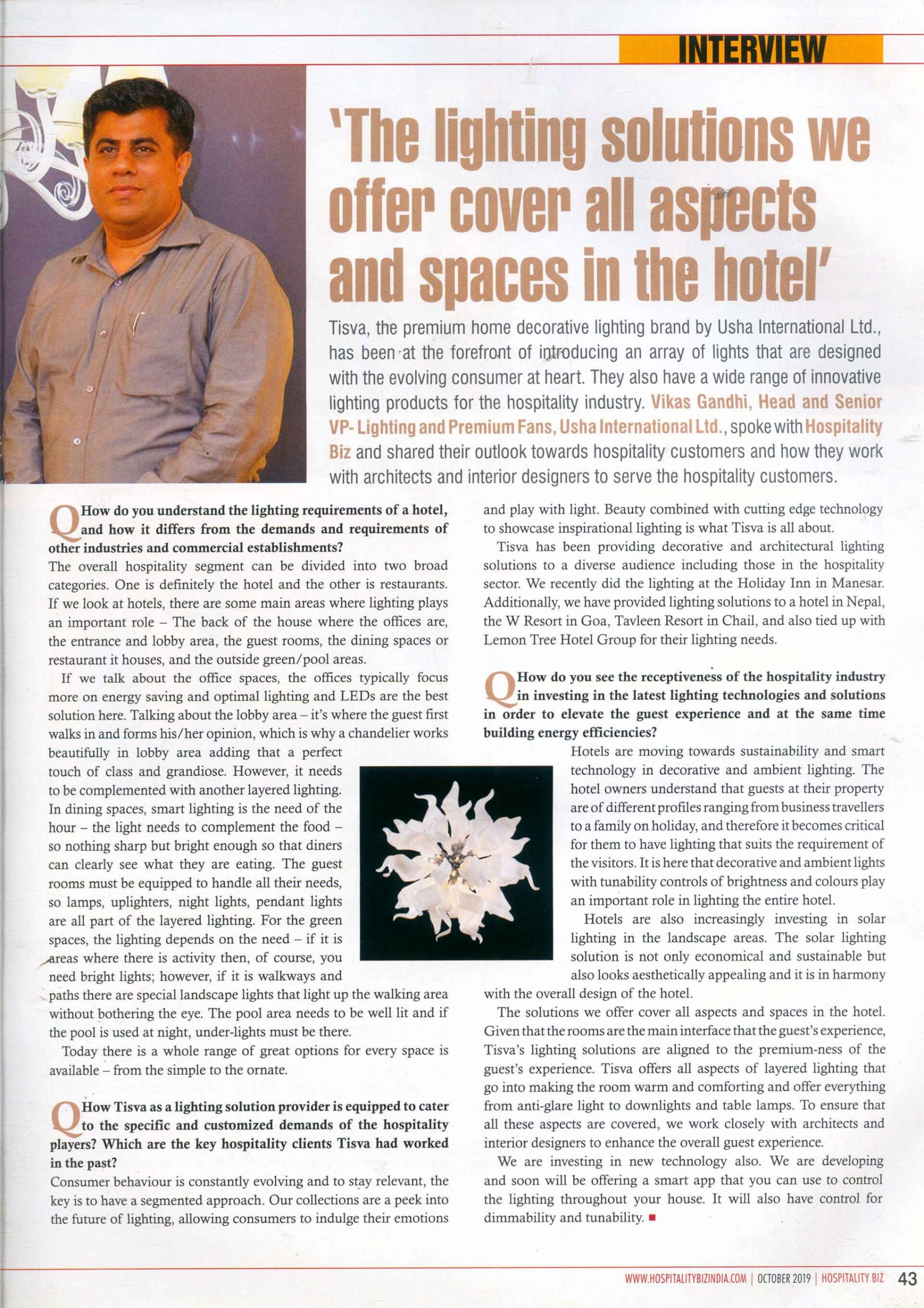
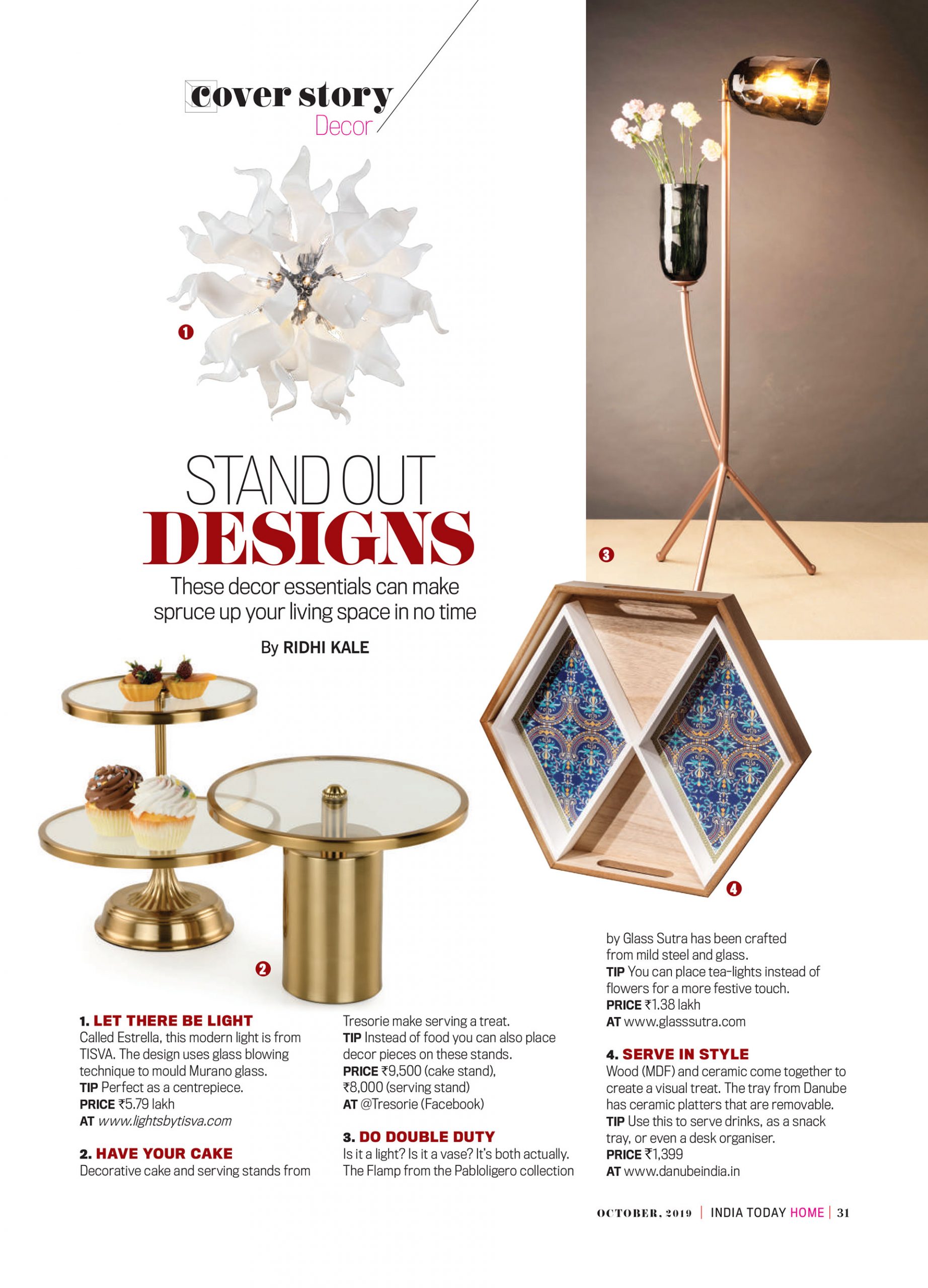
Lighting design is the process via which lighting is made an integral part of the building’s architecture. Good lighting design is integrated both into the architectural concept of the building and its structure.
Lighting should be integrated into the architectural concept in three ways: 1. It should enhance the original design, 2. It should ensure that spaces are suitable for the tasks they have been assigned, 3. It highlights important spaces and de-emphasizes subdued spaces.
To achieve the above, Lighting systems should use lighting fixtures that compliment the interior décor; use hidden elements where necessary, for harmony; and its electrical systems should work harmoniously with other mechanical features of the building.
Visual Clarity
People look for simplicity in their visual environment when involved with complex tasks. Too many visual stimuli or patterns tend to distract us – for example we can read a simple book while listening to music, however if the book happens to be a Quantum Physics textbook, the music will distract us. It is the same with light. Meaningless or confusing luminaries at odd places tend to distract us. Such unnecessary distortions are called visual clutter.
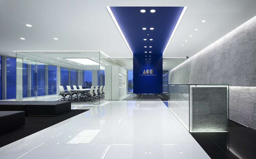
Visual clarity reduces too many external stimuli, giving us space to move around and carry out our tasks without any distraction. In this kind of environment lights don’t unnecessarily draw our attention. The goal of a designer is to create such spaces where such distractions are minimum and work potential is optimum.
Luminaire Patterns
Irregular luminaire pattern on the ceiling is distracting, not just because they create glare or provide too much or little light, but by their very presence. An irregular light source will draw our attention, a distraction, which we must overcome consciously to focus our attention on the work at hand. Whereas, an organized luminaire pattern on the ceiling doesn’t draw any attention. Organizing ceiling lighting with repetitions and careful layouts thus is very important. Using matching apertures and similar dimension light sources with homogenous finish helps further.
In a way Lighting designers can be also be called Ceiling designers, as lighting layout blue-prints take into account placement of not just luminaries, but also air diffusers, sprinklers, smoke detectors, speakers etc. A designer needs to divide the room /ceiling with an invisible grid. And ensure that each grid is provided with the right amount of light. As seen in the diagram it is unnecessary to add luminaries at all intersecting points; and more lights are required in the perimeter than in the middle, as the perimeter light sources also need to light wash the walls.
Architectural Surfaces
Highlighting the right surface in our visual field reinforces our attention to the task at hand. People understand their environment through a process of additive perception. Information is gathered by establishing boundaries of our immediate space; this also gives us a sense of direction and limits. If the lighting design is such that it helps us to establish boundaries, it adds to our sense of direction and space.
Lighting thus helps us to separate spaces in our environment, where spaces illuminated in a similar way are used for similar tasks. Also evenly washed walls and lit ceilings in the same room give structure to the space. This enables us to perceive the room as a composite unit and not as a space made of separate walls, ceilings and floors.
Lighting Vertical Surfaces
Vertical surfaces are very important, as they are the first surfaces that we see when entering a space/room. Often information or communication is displayed on them and they also give us a sense of limit and boundary. Undesired light patterns on such critical surfaces will result in distorting all or few of these features. Ceiling luminaries often cast such undesired patterns on vertical surfaces and at times even leaves them in darkness. The former will distort and the latter will make the space dull and monotonous.
Attention should be paid while using luminaries (be they down lighters, wall or pendants lights), so that they do not throw crisscrossing arbitrary patterns on the vertical surface. As this will give away the idea of a unified space, and the wall will be perceived as a separate entity. Even scallops (illumination around the lamp source) of light break the unified illusion, as the eye involuntarily gets attracted to these bright spaces.
When using down-lighters to light up a room, wall washers should be added to nullify the effect of arbitrary patterns. If the wall happens to be made of specular materials like mirror/glass, this remedy is not needed, as intersecting light patterns are not noticeable on specular surfaces.
Using irregular light patterns will draw attention to certain surfaces. These can be used to create high-tension environment or to highlight certain aspects of the space. Such irregular patterns are desirable at times as they act as temporary visual stimulants. Like a shaft of sunlight in a room or light from electric sources that is independent from the physical shape of the room (multi-colour light cast by a round disco ball on a rectangle room)
Matte Vertical Surfaces
Three different kinds of lighting systems are available for vertical surfaces: 1 Individual units point-source wall-washers. 2 Continuous, linear point-source wall-washers 3 Continuous, linear, diffuse-source wall-washers.
Individual Unit Point-Source Wall Washers: These are luminaries that light up vertical surfaces from top to bottom. They are placed parallel to the wall at about one-third the height of the wall. Luminaries at the centre need to be mounted closer to each other than luminaries at the sides, for uniform brightness – this is known as the square rule.
Continuous, linear Point-Source Wall Washers: These are lamps placed near and along the wall. They light up the wall through their grazing light. The square rule for placement applies for this type of illumination too.
In order to ascertain the correct arrangement (height, distance, space) in such systems, creating a mock-up is necessary. This should take into count beam spread, distance from the wall, height and depth of the lamp and baffles or shields used.
Continuous, linear Diffuse-Source Wall washers: This is a good method to provide horizontal lighting but not vertical due to inadequate luminance. Generally used with fluorescent sources, inadequate luminance can be corrected by adding reflectors. But this only works for walls not exceeding ten feet in height. This kind of placement can be used in low-ceiling rooms.
Specular Vertical Surfaces
While lighting up glossy surfaces like glass or marble, careful consideration should be given to the placement of luminaries. In such cases shielding is also needed to prevent reflection from the surface. Since, these surfaces also tend to create reflected images on their surfaces, bright objects from the field of view should be removed.
Task Lighting
In work areas the primary objective of light is to illuminate the task area without any distractions. There are two ways of doing this – the first through General-ambient approach and secondly via task-ambient approach. The former lights up the entire space uniformly and is used when the task space keeps shifting in the given area, or where a task can be completed from any point in the room. Task-ambient approach is suitable when task areas are fixed. In this case task spaces are provided with focused lighting and the rest of the area made up of casual lighting.
While, creating Task-ambient lighting the focal task glow is determined first and the overall lower luminance source comes second. The primary focused glow generally comes from light sources mounted on or nearby the furniture. The ambient light is either provided by downwards-overhead sources or by upward lights from pendants.
Down lighting
Down lighters provide direct light. The spacing between the down lighters is either provided by the manufacturer or through the formula: Space =MH (mounting height) x SC (spacing criterion). It should be noted that partitions in the room (in form of office cubicles etc.) will stop light from reaching all areas uniformly, thereby creating shadows – this needs to be taken into consideration while spacing the down lighters.
Up lighting: This is generally used where work involves specular surfaces like computers or VDT (Video display terminal) screens. To avoid reflection from the screen, up-lighting is used to uniformly light the ceiling, which in turn provides reflected light to the task area. Besides increasing vertical illumination a series of well-arranged up-lighting sources will also increase light distribution.
Good up-lighting ensures uniform ceiling lighting by lowering Luminance Ratio (ratio between the brightest surface and the darkest surface). If specular surfaces are being used the ratio should be lower than 4:1, to avoid reflective glare.
The major drawback with up-lighting is that it reduces our sense of visual clarity, depth perception and orientation. This can be avoided by using colorful horizontal (work) and vertical surfaces. As colours tend to add visual interest compensating for lost perceptions.
Down-lighting vs. Up-lighting: Down lighting works by lighting up horizontal work surfaces, and provides negligible ceiling illumination. Up-lighting on the other hand illuminates the room through indirect/reflected light from the ceiling. A combination of direct-indirect system accomplishes both.
Lighting Art
Lighting Three-Dimensional Objects: Three-dimensional objects are perceived as a composition of highlights and shadows. Concentrated beams create higher contrast and deeper shadows emphasizing surfaces and textures. Frontal light at 30 to 45 degree from the center of the object, will give the same effect as sunlight falling on an object. Lighting the vertical surface behind the object with diffuse light will separate the object from the background, thereby increasing the focus on the object. Wrong backlighting will distort the object on display hence careful consideration is needed on light placement.
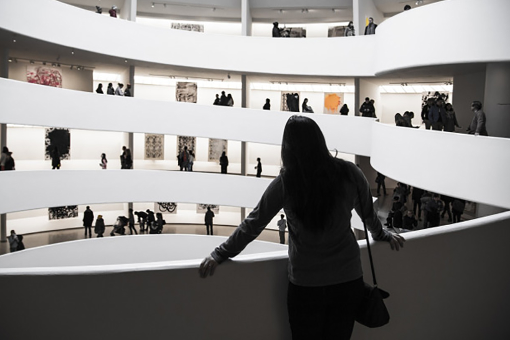
Paintings and Flat works of Art: There are two types of illumination for flat surfaces – uniform and non-uniform. Uniform lighting will highlight all pieces of displayed art, without highlighting any particular piece. Non-uniform lighting highlights different pieces with different degrees of brightness thereby establishing hierarchy.
The placement of the light source depends on the material – medium, frame and texture – of the piece displayed. The optimum position to light up flat surfaces is to place a light source at a 30 degrees angle from the top. An angle lower than 30 degrees will create shadows; and a higher angle will produce glare.
While using non-uniform sources to light up many pieces in a room, the square rules needs to be followed. Where the light sources in the center are arranged closer than light sources at the two ends.
When using non-uniform systems for works of art that constantly keep changing (like in an exhibition) flexible sources or track systems are ideal, as they can be adjusted to focus on various aspects of the changing pieces. Irrespective of the light arrangement used, it should be ensured that the lamp has excellent color rendering properties by virtue of a higher color temperature in order to bring all the colors to life.
Conservation of Materials: Works of art may get damaged due to exposure to heat the light source. Care should be taken to avoid such damages. The light sources should avoid Ultra Violet (UV) and radiation rays, which tends to effect the pigmentation of the work of art. Not just electric light sources but also sunlight tends to do so. (Sunlight has a higher quantity of UV rays than electric sources).
To conserve a work of art one needs to evaluate daylight exposure, electric light exposure and duration of the two exposures. For the first various UV filters in form of plastics and acrylics can be used. Similarly electric light sources should have UV and radiation filters. For fairly stable pieces composed of oil, lacquer etc., Museums generally use 15 fc (foot candle) luminance and for sensitive materials like watercolors, manuscripts etc., 5 fc is recommend. To fight excess duration of exposure, Museums use lower quality of light, which juxtaposed with even lower ambient light, allows better color perception.
Balance of Brightness
Lighting design involves a balance between three elements: ambient light, focal glow and sparkle. The balance of these three elements creates the right task area and emotional spaces.
To create such spaces, it is necessary to focus on a space in order to separate it from the background – be it a table in a restaurant, a desk in an office or a painting in a museum.
It is often desirable to light opposing walls in a room to establish a balance of brightness. This balance shouldn’t be confused with symmetry as the two walls can be lit in different ways if desired – for example one may have a focused painting, which the other wall lacks. Similarly there should be a balance in brightness between the center and the perimeter. If a room’s breadth is far greater than its height, it would be impossible to light it up by illuminating the opposite walls. In this case down-lighters should also be used; otherwise the room will look gloomy.
Lighting patterns also effect people’s orientation and perception: Object-lighting and Shelf-lighting influence attention; and Wall-lighting and Corner-lighting influence depth and size perception of the room. Other patterns can be used to communicate ideas, as the eye is involuntarily drawn to bright objects or objects with high contrast setting. The manipulation of light by separating spaces from backgrounds can enchant, delight and command attention depending on the pattern used.
Luminance Ratio
Luminance Ratio denotes the ratio between the brightest and darkest spaces in an area. It is necessary to maintain a low luminance ratio is task spaces in offices for pleasing and productive environment. However, the whole office shouldn’t follow the same ratio, as it will give rise to a dull low-stimuli environment. Relaxation areas should be separated from task spaces by increasing the ratio in these spaces. Perception of brightness also depends on reflectance. So attention should also be paid to the type of surfaces – specular and non-specular – used.
Shadows: Shadows are as important as light in lighting design – just as silence between beats is a part of music, shadows between lights is part of the overall design. Monotonous uniform light without any shadows will create dull environments. Shadows shouldn’t be seen as being antagonistic to light but as counterparts, like the Chinese Ying and Yang philosophy. Without shades light will lose its meaning.
It should be kept in mind that all three-dimensional forms are perceived through light and shadows. If a corner is made very bright, the eye will not be able to decipher properly the meeting point of the walls, hence losing the sense of boundary and thereby space.
Energy-effective Design
Successful lighting design should be energy effective, using the given amount of power to light up the required space when needed. It involves careful brightness manipulation and light control in order to achieve optimum result with limited energy. Effective design also includes arrangement of lighting systems in such a way that the right light is used for the right task providing desired perception and orientation.
Integrating Light and Architecture
Successful integration occurs when lighting systems are part of the architectural fabric in terms of aesthetic and mechanism. The latter denotes using the right electrical system, which compliment the building’s other mechanism. Seamless integration is achieved when people are not aware of the lighting system as a separate entity but perceive it as another comfort mechanism of the building. Since light influences well being, the object of great lighting systems in architecture shouldn’t be just concerned with the quality of light but with the quality of life

